Production company logos and production company names are two very basic components of a media product construction and when me and my partner started thinking about our logo design and name, we had many ideas, however researching and finally making it was another story altogether. We focused on the look and feel of the suggested titles that we had come up with for our production company house and finally decided on one.
i) Panic Attack: this one gave a tragic feel to it
ii) Bombshell: this one gave a noisy and grungy effect
iii) Andaaz: this was a considerable name
iv)Yellow Paint Studios: this name held significance in terms of being sombre. It neither held the tragic effect, nor it gave the grungy effect, in fact was substantially decent.
v) Purple Alien Film: this name was highly considerable, however the yellow paint studio was easy and comprehensive to construct.
Our final production company house name was inspired by names like 'tree green leaves productions, gutz film, reelium films, ink stories, spontaneous combustion, etc. Such interesting and not-so-formal names suited our film genre perfectly because our film will also be based more along the lines of the rural culture and how life is not so executive for them.


Having obtained an idea about how our production house' logo may be designed, I searched for an inspirational logo which would help me in constructing a logo that fulfilled both my demands to:
a) be creative, and
b) hold some sort of indication of a film company logo
This is what best suited our preferences:
i) Panic Attack: this one gave a tragic feel to it
ii) Bombshell: this one gave a noisy and grungy effect
iii) Andaaz: this was a considerable name
iv)Yellow Paint Studios: this name held significance in terms of being sombre. It neither held the tragic effect, nor it gave the grungy effect, in fact was substantially decent.
v) Purple Alien Film: this name was highly considerable, however the yellow paint studio was easy and comprehensive to construct.
Our final production company house name was inspired by names like 'tree green leaves productions, gutz film, reelium films, ink stories, spontaneous combustion, etc. Such interesting and not-so-formal names suited our film genre perfectly because our film will also be based more along the lines of the rural culture and how life is not so executive for them.


Second step in the designation of our production house was to construct the logo. To form the basis of our logo, we researched other logo designs. The common elements found in almost all the logo designs was the availability of a creative name and not a very formal one, and the availability of some signifiers of film production i.e an eye, a reel, a camera, a shot board, etc. For example:
a) be creative, and
b) hold some sort of indication of a film company logo
This is what best suited our preferences:
This logo somewhat met my needs because it is creative, it holds a symbolic camera on a tripod in the background and is not only simple but also has graphics in it whereby the collation of a camera design and a persona subjugates the concept behind the distribution company's name 'RUN' very finely.
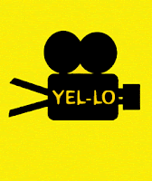
Since the logo title, 'Yellow Paint' does have a very cliched feel to it, we decided tomould the title into 'Yel-lo Productions' which may even give the effect of a production house that has rights over films produced under the invisible banner of 'creating awareness' and of 'educating people about their rights'.
This is what we came up with:
The idea of using the marquee tools for the construction of a camera was inspired by the logo of 'RUN' productions while the name was inspired and moulded to give it a significant impact with relevance to the theme of our short film. We have used the 'Orange LET' font from www.fonts.com after testing with various other fonts like
Having tested various fonts, we shortlisted 'bubbletea' and 'orange LET' and somehow when we tried either of the fonts with our graphic, 'orange LET' simply jelled in. Bubbletea, on the other hand, looked a bit too crowded in and didn't enhance the 'yel-lo' so well.
And this is how, after much trying and testing did we come up with our final logo design.


.bmp)


.gif)
Your post is very comprehensive regarding the importance and technicalities of company logo designs. No-doubt that logo designs are front faces of every company therefore these should be unique, attractive and meaningful. For this purpose everyone who is looking for a professional logo design company should hire cheap and quality logo designing firm which can fulfill all designing requirement effectively.
ReplyDeleteThanks for sharing for more info. visit http://www.fivefingersmedia.in/
ReplyDeleteVery inspirational to hear about someone pursuing their dream and becoming successful instead of following the traditional path.
ReplyDeleteSport Logo Design, Eposrt Logo Design, Mascot Logo Design, $5 Logo Design Service
Thank you for taking the time to write such an informative post. Your blog is not only informative, but it is also very creative.
ReplyDeleteaffordable logo design company