Pages

Showing posts with label Construction. Show all posts

Sunday, 17 March 2013

Construction: Movie Review Page

Having developed the poster, we know moved on to the making of a movie review page on a double page spread which we had prior experience of using for our Foundation Portfolio with the magazine. Our movie review page was to feature the main codes and conventions of a movie review page which were a two-columned layout, a main image, an intro, a secondary image and movie details. For the execution of our page, we required two images, one of which we already had available while the second one too, was available in its raw format. The raw format available was not very sufficient as it didn't have the under-privileged effect in a commercialised world which the image was to depict. This main image was shot properly during the shooting procedure however, it was nipped and tucked to give it the desired effect. The background hereby is the amalgamation of two fast-moving roads shot by Dua while the image has been skewed to give it this demented impact. Then, we decided on the text that would introduce our movie to the audience. Amongst the choice of either starting in a purely conventional way introducing the movie to the audience, lets introduce the movie review by reviews from the audience. Hence a story was written with an introduction attached with it which was then added to the page. The main details were very easily written and required no prior planning as all the information was already available to us in terms of directions, genre, production houses, casting and the likes. Conventional movie review contain a page title on the very top corner of the page. Our review page was pre-planned to be sold out through Smash magazine which is a top movie magazine for teenagers in Pakistan. The page was hence titled 'feature' as per Smash's layout to give a link to the institution.
The context behind the main image was to show the passion young children have of earning their parents' respect and how they are harassed by their parents' themselves for not being able to bring sufficient funds at the end of the day to add to the days income. The demented effect that was added to the image was to reflect the tired that one feels after constant degradation and torture and how he/she simply gives up and accepts their fate. 

The colour palette for this page too was pre-determined once we had the image available to us. The costume worn by the model was chosen to be reflected in the colour scheme while the busy life in the background added activity to the page. The font used for the story and the introduction was Consolas. Text wrapping against the outline of the main image gave a very interesting effect to the story and its layout. Once the movie review page was ready, our Media teacher suggested a few changes that would lift the overall mood of the movie review. Once this was done, we had the movie review page ready


Final copy of our movie review page is in the following: 


Friday, 15 March 2013

Construction: Poster

Once we were done with our short film, we starting researching posters and analysed their codes and conventions in order to understand the basic layout of the poster and how its conventions attract the audience towards the media text it is promoting. When reviewing the conventions, I had the basic idea about how our poster will be designed. However, we required a very effective image to give a poster effect to it. For this purpose, Dua merged two images that she had shot during the shooting procedure. When taken votes on which one well-suited the layout of a poster, this image was chosen for the poster while the other image featuring Surraya was used for the 'main details' in the movie review page. 
When shooting with Surraya, the image was to give away a poverty-stricken child's emotions so as to inter-link the film with the poster and hence was deliberately shot under sombre but white lighting. The expressions of Surraya were also directed according to the mood that the image was to set. However, when laying it out in a poster, it just didn't sync so well. 
This image gave the poster a very modest look but it didn't hold enough power to provoke the audience. Hence, it was just too serene for something that is meant to attract the immediate attention of the audience. Contrary to the first image, the second images which were to be amalgamated into one were shot during the shooting process and low-key lighting as were used for the film was used, in order to create a relationship between the film and its poster. This image represented the concepts of hope, faith and struggle all in one image as the flickering candle signifies struggle, the hands encircling  it signifies faith while the low candle light itself conotates hope. Hence, presenting the main ideology behind our film to the audience. The image that this image was merged in with was of burning wood which looked like a real treat to the eye in the technological world, that we are living in.

Image 1

Image 2
Now that we had the images, we could easily decide upon our poster’s colour palette which was definitely going to be in contrast or combination with the image. Our title, we had decided very early on during the short film planning, would use the same font throughout the three texts to inter-link them. Next in line, came the formulation of a catchy tagline which we chose upon by amalgamating the poster’s analysis and the short films’ narrative and came up with the tagline; despair, hope, struggle. Secondary to this tagline came its connection with the short film as it stated –‘for a better tomorrow’ and that too in green to signify the colours relativity with the films’  local audience. Now that we had all the raw material that was to be edited in order to obtain a final product including the main image, colour palette, tagline and the title, all that was left was the usage of a conventional poster layout for the execution of the data available. So we began researching posters for the placement of taglines, casting details, titles and image in a poster and not only this but also the ideal page size required for the making of a poster on. It was quite interesting to find out through this research that the page size for a magazine cover and a poster differed. While a magazine cover is on a page of 8 by 10 inches, a poster is created on the dimensions of an A3 page. We came across a major trend in the usage of main images in posters to look at the audience directly in the eye, almost like as if forming some kind of relationship with them. The casting is placed on the very top of the poster, if it is not very extensive while casting details, if lengthy, are placed at the very end of the page. The title is usually very emboldened and large so as to highlight the title of the media text as a title is what rounds up its entire content.
Now, that we had all the information that was required, we began by placing the colour palette in the background and added boxes to the work space with guide lines to ensure efficiency and neatness. Having done this, we then added the image to the poster and began placing titles, taglines and casting information as per the conventional codes and conventions of media text. However, our poster still lacked something as its look and feel continued to look boring. When we consulted our Media teacher for views on this, he asked us to make a sparky effect in the background with a paint brush to represent the fast-paced times, this country is coming to and how it is effecting the under-privileged as they get robbed off their rights. When we added the required effect to this poster, it finally looked like something successful and meant for the audience.


When playing around with the placement of text in our poster, I realised the significance of placement of text as I re-developed the texts placement and made it look something like this. When I took feedback on this poster, however, I was asked to change the placement of the tag line in the poster and improve the versatility of colours. Hence, when this poster was  re-edited, we finally had a product that was approved by all.

First attempt


Final product

Tuesday, 12 March 2013

Evidence Clicks with Dua on the Camera

During the start of the production process, me and Dua divided our duties. As Dua was good with the workings of the camera, she took control of the shooting while I assisted in the setting, lighting, acting and the other aspects of the shooting procedure including taking evidence pictures while Dua worked. We took test shots wherever they were required.
Dua on the camera:
Confirmations


Test Shots. Directed by me.

Friday, 18 January 2013

Short Film Title Designation

Titles perform a significant function of any film, short or not. These titles are aligned with the theme of our films and allow the audience to relate to the concept behind the film, beforehand. We decided up on 'possibility Pakistan' as our short film title, in the very primary stages of our research. This title justifies the theme of short film i.e Pakistan as a community that is not in a very stable condition and how its people are living their lives through these circumstances by looking for  possibilities to a better tomorrow.
To design our short film title, we came up with ideas about our film title designations and sketched the one that best suited both of our preferences. Then we researched various other movie and drama titles to decide on our font and color scheme for our title. This is what we found: 


We wanted a very cultural font for our short films title to give it a Pakistani effect that narrates a traditional outlook. Hence, after much research we settled on Arabic fonts. Here are a few fonts that we tried.


Having selected 'Arab Dance' as my selected font, it was now imperative that I use that font in such a way that it brings forth the theme of our short film which is based on Pakistan and its people.


This what our final title looked like:


Thursday, 17 January 2013

Production Company Logo Design

Production company logos and production company names are two very basic components of a media product construction and when me and my partner started thinking about our logo design and name, we had many ideas, however researching and finally making it was another story altogether. We focused on the look and feel of the suggested titles that we had come up with for our production company house and finally decided on one.
i) Panic Attack: this one gave a tragic feel to it
ii) Bombshell: this one gave a noisy and grungy effect
iii) Andaaz: this was a considerable name
iv)Yellow Paint Studios: this name held significance in terms of being sombre. It neither held the tragic effect, nor it gave the grungy effect, in  fact was substantially decent.
v) Purple Alien Film: this name was highly considerable, however the yellow paint studio was easy and comprehensive to construct.
 Our final production company house name was inspired by names like 'tree green leaves productions, gutz film, reelium films, ink stories, spontaneous combustion, etc. Such interesting and not-so-formal names suited our film genre perfectly because our film will also be based more along the lines of the rural culture and how life is not so executive for them.


Second step in the designation of our production house was to construct the logo. To form the basis of our logo, we researched other logo designs. The common elements found in almost all the logo designs was the availability of a creative name and not a very formal one, and the availability of some signifiers of film production i.e an eye, a reel, a camera, a shot board, etc. For example: 


 Having obtained an idea about how our production house' logo may be designed, I searched for an inspirational logo which would help me in constructing a logo that fulfilled both my demands to:
a) be creative, and
b) hold some sort of indication of a film company logo

This is what best suited our preferences:


This logo somewhat met my needs because it is creative, it holds a symbolic camera on a tripod in the background and is not only simple but  also has graphics in it whereby the collation of a camera design and a persona subjugates the concept behind the distribution company's name 'RUN' very finely. 

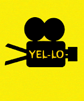
Since the logo title, 'Yellow Paint' does have a very cliched feel to it, we decided tomould the title into 'Yel-lo Productions' which may even give the effect of a production house that has rights over films produced under the invisible banner of 'creating awareness' and of 'educating people about their rights'.

This is what we came up with:


The idea of using the marquee tools for the construction of a camera was inspired by the logo of 'RUN' productions while the name was inspired and moulded to give it a significant impact with relevance to the theme of our short film. We have used the 'Orange LET' font from www.fonts.com  after testing with various other fonts like 

 Having tested various fonts, we shortlisted 'bubbletea' and 'orange LET' and somehow when we tried either of the fonts with our graphic, 'orange LET' simply jelled in. Bubbletea, on the other hand, looked a bit too crowded in and didn't enhance the 'yel-lo' so well. 


And this is how, after much trying and testing did we come up with our final logo design.